Wedding Tip Wednesday | Color Palettes
March 18th, 2018
There are a few things that you typically decide on shortly after becoming engaged: when you’re getting married, where you’re getting married, and what your color palette will be. The colors of your wedding are what make it unique and personal to you. Color palettes can range from shades of pink, to blues with pops of gold.
1. Think about which color palettes fit the season of your wedding.
Two of the most popular times for weddings are the spring and fall. People tend to stray from winter and summer as they are too hot, or too cold. Regardless of what season you decide to get married in, it’s important to take that season into consideration when choosing color palettes. Spring and summer tend to have colors that are brighter and warmer, such as yellows, pinks, and purples; fall and winter tend to have darker and cooler colors, such as deep reds, oranges, and navy. Now, let me say this: the season of your wedding DOES NOT have to determine your color palette. Just because you are getting married in the fall, it DOES NOT mean you have to have oranges and shades of brown. If you want pink in your November wedding, you do it, girlfriend! The season of your wedding is only one of the many aspects to consider when deciding on color palettes.
2. Consider the venue when thinking about color palettes.
Each venue has specific details about it that make it unique, just as your wedding will. Among those details, you will find that certain colors fit better with that venue. When you tour your venue, pay attention to what colors are most prominent. Look at the floors, the walls, the ceilings, light fixtures, and the furniture throughout. Try to visit the venue around the same season in which your wedding will be held. This will help you determine how the landscaping will look, what flowers are in bloom, and what decor (if any) is being used. Some venues, such as The Festivities Event Center, offer a blank canvas that allows you to implement almost any color and it will look amazing. You can see what I did with that blank canvas here.
3. Decide what vibes you want the colors to give.
If you have ever studied color psychology, you know what I’m talking about. Essentially, color psychology is the study of how certain colors determine human behaviors. For example, when you see the color yellow, you typically think of sunshine and happiness. When you see the color black, you typically think of darkness and sadness. It is totally worth it to do some research in regards to the colors of your palette. Do you want to give off a happy vibe? Peaceful vibe? Joyful vibe? Let your color palette tell the story of the feelings at your wedding.
4. Do you have a theme?
Some weddings simply revolve around a color palette, while others tend to have a central theme. Some that are getting married in December might have a Christmas theme, while those getting married in October might have a Halloween theme. I’ve also seen themes come from movies, such as Lord of the Rings, and location, such as the south. No matter what your theme is, it’s always helpful to tap into that theme and make sure your color palette compliments it.
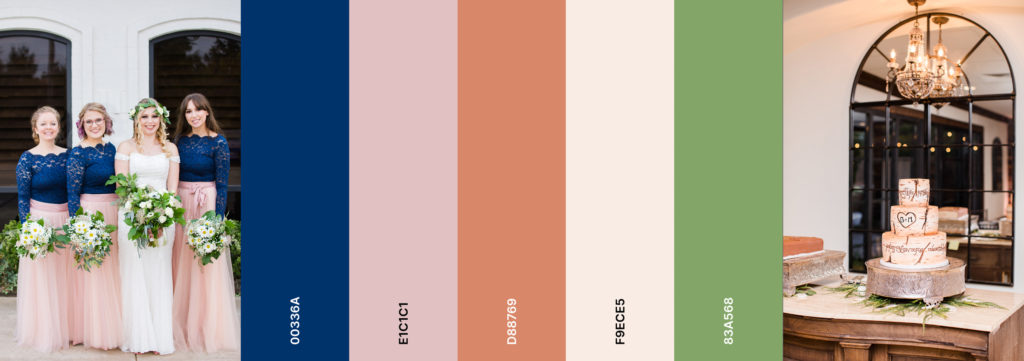
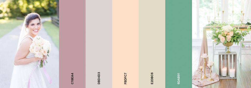
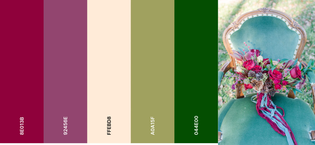
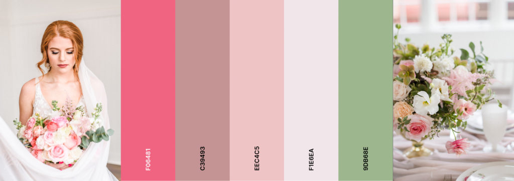
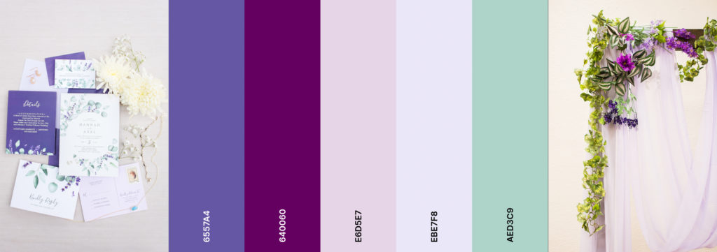
5. Try to have 4-7 colors in your color palette.
Now, I’m not saying you need to have each color of the rainbow, but having more than one color is important in order to make your wedding look cohesive, rather than boring. I recommend choosing one or two main colors, two or three secondary colors, and some accent colors. Often times, the colors in color palettes are just different hues and tones of your primary color. For example, you might have dark pink, light pink and blush; or navy, light blue, and dusty blue. You will typically use your main colors when picking out bridesmaid dresses, ties, table cloths, envelopes, and even the main blooms of your bouquet. Secondary colors are usually used for the napkins and smaller blooms of your bouquet. Your accent color is typically the least used, and will be used for to just bring a pop of color, such as nail polish or jewelry. Remember, metallics, such as silver and gold, count in color palettes too!